Iota Press Books

The most recent books are shown first, and in the Farflungland section are another group of chapbooks I’ve printed recently. All are letterpress printed and the texts are set by hand. There are still copies left of most of these… contact iota@sonic.net if interested in purchase.


TYPE HIGH [2021]

A book to evangelize for the joy of typesetting by hand. There are quotations from old books, some anecdotes typographically illustrated…and some poetical improvisations. Aside from the quotes, every page was composed directly from the type case of Poliphilus 13/12 point type. In some ways this is an homage to Poliphilus and its creator, Aldus Manutius, the great Venetian humanist printer of the late 1400s. In other ways it is an indefensible mishmash of heresies.

24 pages. Edition: 73


SHORT SORTIES [2021]

During the pandemic I used my early mornings to write and draw with quill pens using homemade ink. The poems were influenced by the drawings, typed on my old Underwood.

24 pages Edition: 64 Zerkall text paper, Saint-Armand cover, Goudy Modern type


TEXTUS [2018]

The first letterpress book for the smartphone generation. The apps on the cover come with Textus, and all the memes inside are in the public domain, like you. Whichever virgin of reality you subscribe to.

15 pages Perfect-bound Edition: 35


WITHIN THE GRAIN [2017]

I made this accordion book to catch the compositional method of writing in a stream without periods.Type is set between the curves cut in a 16” plank, then each stanza printed three times, with no ink added after the first proof. The end papers are printed from a length of fir, wire-brushed to reveal the grain.

Three left with possum-hide(really !) binding Edition: 14 Fully extended: 10’


ARCHETEXTUR [2015]

After printing an edition of a large broadside tower of Babel, I decided to use the type form before taking it all apart. This grew into a musically-influenced book form with four movements. The first is the completion of the tower in four pages. The next is four pages as if one were looking at an emblem book from the culture that finally completed the one-language tower. The third is four variations on a gibberish text from this language. The fourth is composed of four dreams of an infinite typosphere in which strange forms float and a solar image reddens progressively on each page.

Best of show: Book Arts Exhibit, Sebastopol Center of the Arts 2015 Edition: 24, sold out.


ROCKET STORY [2013]

In 2013 I offered to make a book for anyone in my immediate family…and this was one of them, under the imprimatur ‘Knee Pot Editions’. My eldest son Arne told me his boy, Harldur, had awakened in the night upset by a dream…and his account was so riveting that Arne wrote it down. We decided it should be a picture book.


SPIDER FRIEND [2013]

The other Knee Pot Editions book came from seeing one of my son Dino’s wonderful surreal improv stories. He allowed me to illustrate it with our cuts with only the rule that no image could have anything to do with the words on that page. So I was off, running. For the cover he and his two children, Ivy & Sebastian, came to the shop and Dino told the kids to choose a bunch of stuff for the cover from our hundreds of images. Again, no meanings were allowed.


COLD BUT SANE [2013]

As part of printing for family members, this project was a form of courtship for my youngest son Gabriel. Katrina & he met in graduate school studying poetry, so he wanted to print her first book. A wonderful stretch of time setting type together and making a sweet gift.

16 pages Edition: lots


CATS PAJAMAS [2013]

In 2013 I was creating a card deck of typographic compositions on an alchemical theme, and decided while they were on the press, I should use them to make a small chapbook. The images progress from gold trapped within dark matter, slowly releasing until free at the end.

12 pages Edition: 41


PERUVIAN PORTALS [2013]

A fine art collaboration between mezzotint artist Holly Downing and poet David St. John in homage to the people and culture of the Andes. Includes a poem of St. John’s translated into the indigenous language Kichwa. (which used up all the ks in my font). Exhibited at USC Library gallery.

Edition: 15


BLIND i [2012]

A very small booklet with a short poem spread out in a sequence of graphic invention simulating the Venetian blinds on a window at night...the image from the poem.


GONER [2009]

This started as a set-piece intended for practice with using initial letters, and turned into something I cared much more about. Four lyric riffs as texts, linked in theme.


THE VIEW FROM HERE [2011]

A chapbook for a poet friend, Patrice Warrender. Her own drawings and a variety of writing. Many pleasing sessions of collaborating on the book design.

32 pages Edition: 100


WHAT THE FLOWERS DREAM [2011]

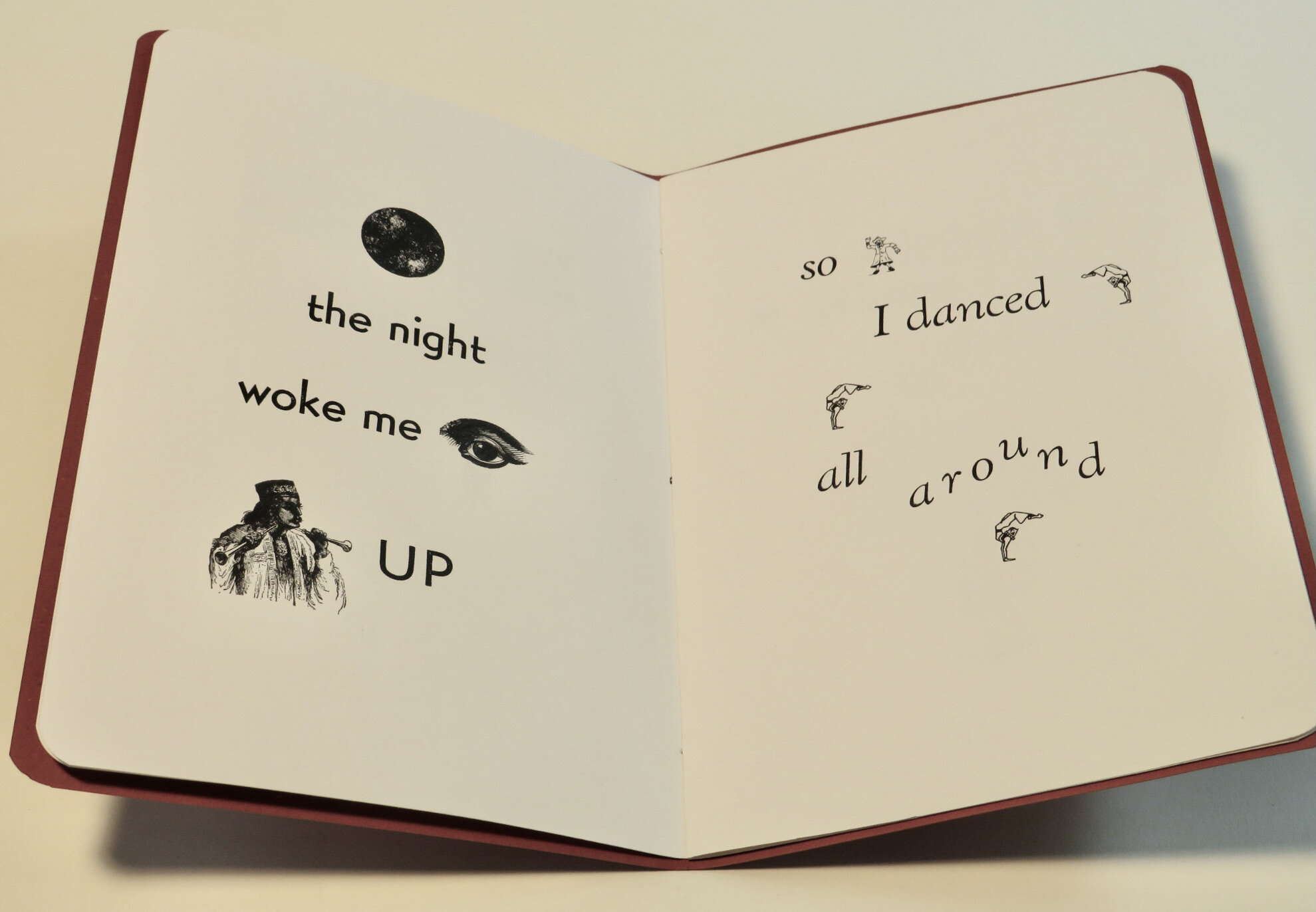
Lin Max won a regional competition for a chapbook MSS, which Iota Press had volunteered to print. With Lin’s brilliant drawings and energetic assistance on all phases of this book, we finished it in just a month, in time for the public reading. I made my first crucial irreversible typo here, printing the word ‘me’ as ‘em’. I confessed to Lin and offered to reprint all the pages, but she laughed it off: “nobody will even notice”. Did anyone ?

28 pages Edition: 100


LANK, BEAK & BUMPY. [2010]

The only chapbook I ever printed from an unknown & distant client. From the East Coast, Mark Jackley contacted me through the internet and we negotiated a price for a book designed similarly to others I had done that he could see online. It went very smoothly to my surprise, as Mark was usually quick to decide and happy with all the results. Reviewers mentioned the fine quality of the letterpress edition(!)

32 Pages Edition: 100


HOUSE SAMURAI [2008]

Guy Biederman was a neighbor who wrote short fiction, and he had done a series of droll poems about being a househusband. This was a simple pamphlet-style chapbook, but had a nice look aided by Guy’s son’s drawings.

16 pages Edition: 99


ELEGIES FOR AN ICE AGE [2007]

A book of poems written during 2003-7 with a couple of my own graphics. The titles are in ‘16th Century Roman’ which I admired so much in Don Emblen’s shop that he gave me the font. And the poems are in Poliphilus, which I had picked as my house font, based on my admiration of Renaissance Venetian type. [Poliphilus is a facsimile of type taken from a book printed in 1499 by Aldus Manutius. It is also the digital font on this website]. The themes included lyric fury about the invasion of Iraq..

Edition: 100


AIR APPARENT [2005]

The first book I made with my own press, a Vandercook SP15. It was the reason I ventured into letterpress… as someone had told me that plates could be made of my graphic poetry. It was exhilarating to make my first book by hand….48 pages, an edition of 150. I had hypnotized myself into ‘founding a Press’ and publishing enough copies to go around to bookstores.

Edition: 150 Sold out.


BUFFALO ROME [1996]

My first published book, by a small press in Santa Monica. Printed offset… the publisher included me in the design which was my first taste of typography and layout. It is a set of poems and drawings spanning 1985-95. Many copies still in my garage! Only $8 apiece! Be the first on your continent, order multiples before supplies run out!

Postcard 1997: “Many thanks for your fine book! I love the interplay with the drawings – and the poems are solid. My best, Robert Creeley


PINEAPPLE RAIN [1964]

When I was 18 I dropped out of Reed College and lived in the basement of my aunt’s flat in San Francisco for a few months. Her three kids were in grammar school and it kind of saved my life to be able to play at being their big brother. They had a strange old book called “The Great Panjandrum” which was a string of nonsense paragraphs in the tone of Lewis Carroll. I loved reading it to them with great feeling, especially “What, no soap?!!” After I moved out on my own I thought I could write something as goofy, and this was the result. The original was inked on a blank accordion book, and was a great sensation in their household for awhile. A friend thought she could get it published and took that only copy….and eventually lost it. Fifteen years ago, I found the notebook with the old sketches and redrew it so I could give my cousins at least a xerox version. I place it here because it was the first time I thought how to turn my creations into a book. And because I had discovered ways to fuse words and text as a gift.

22 Pages